Instructions
How to Make a Chart in Excel
May
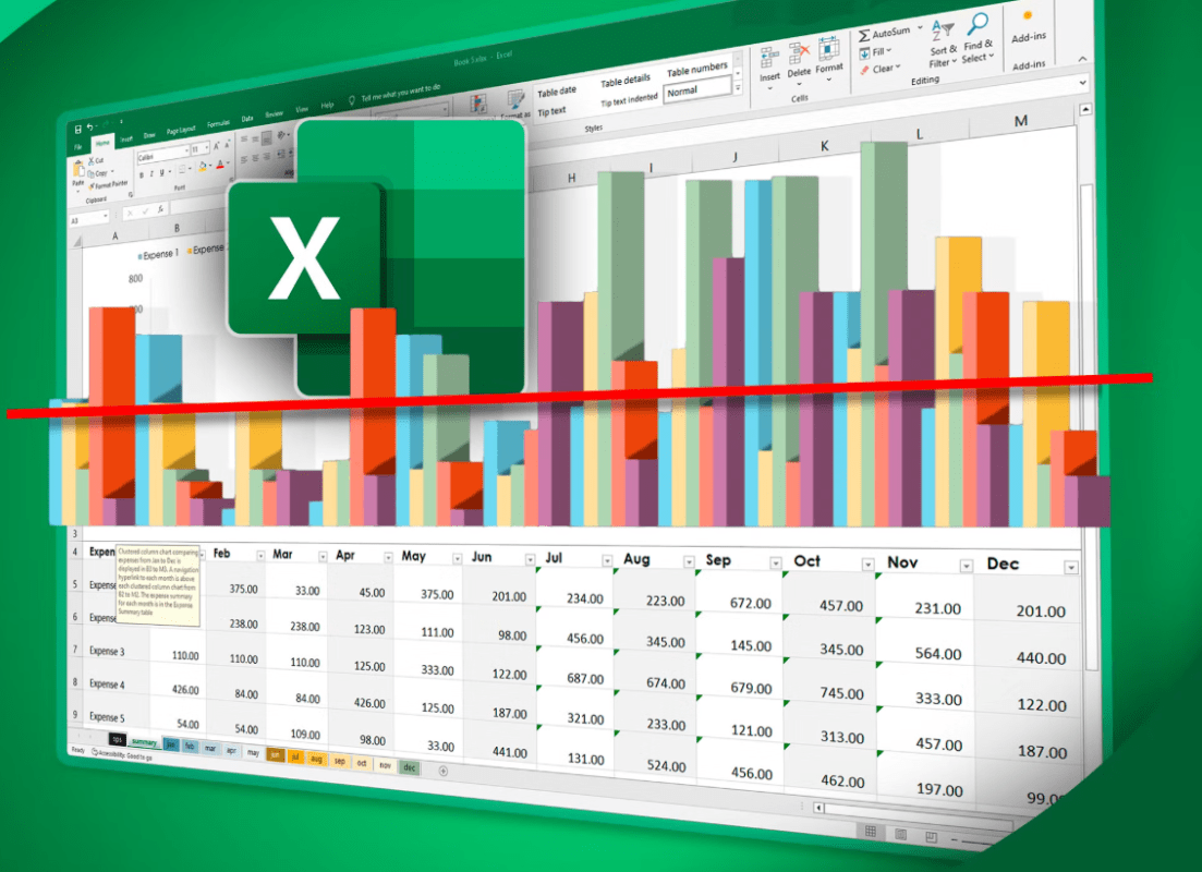
Charts in Excel help turn raw numbers into something easier to understand. Microsoft says charts help you visualize data for stronger impact, and it recommends either using Recommended Charts or choosing a chart type yourself based on the data you want to show.
For most users, making a chart in Excel is simple once the data is organized properly. Excel can create common chart types like column, bar, pie, line, and scatter charts, and Microsoft says the Recommended Charts feature can help you choose one that fits your data.
The Short Answer
To make a chart in Excel:
- select the data you want to use
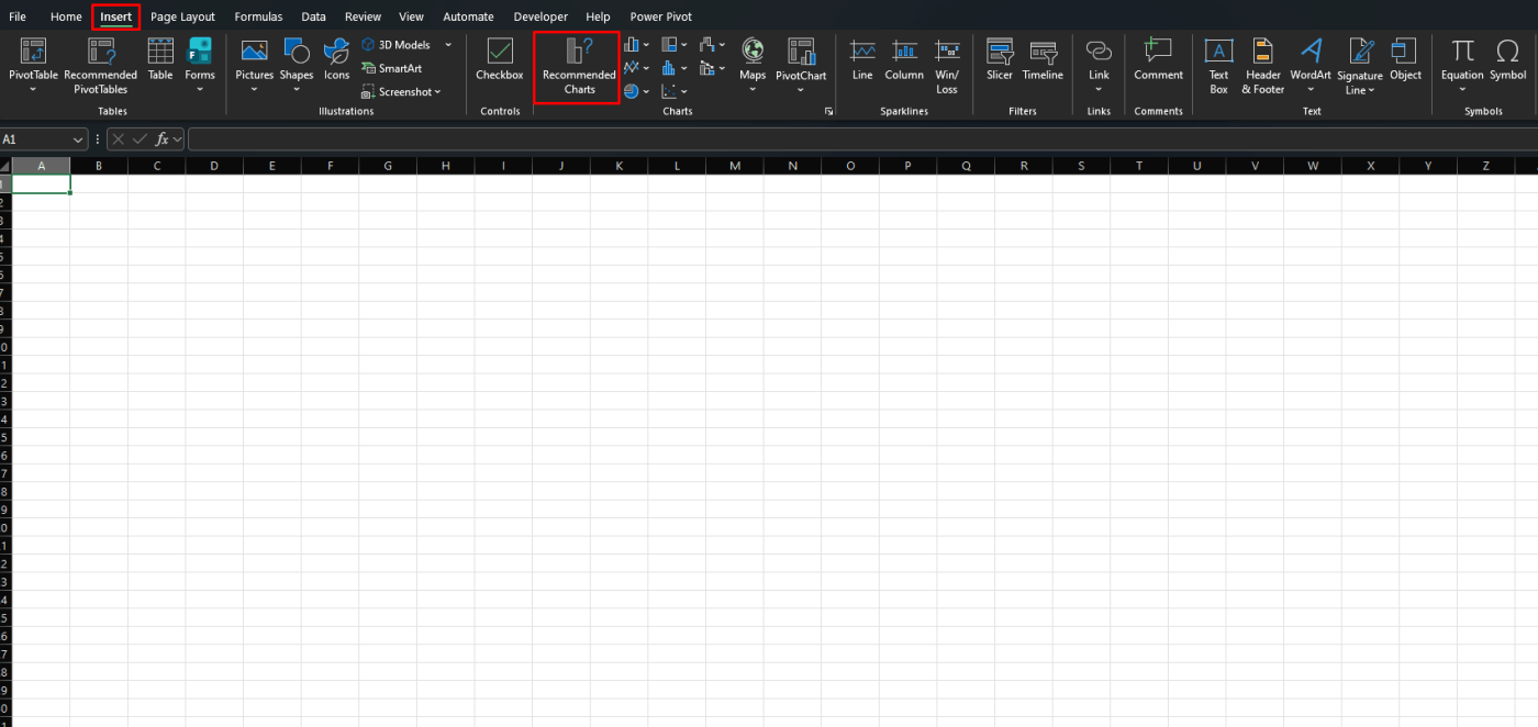
- go to Insert
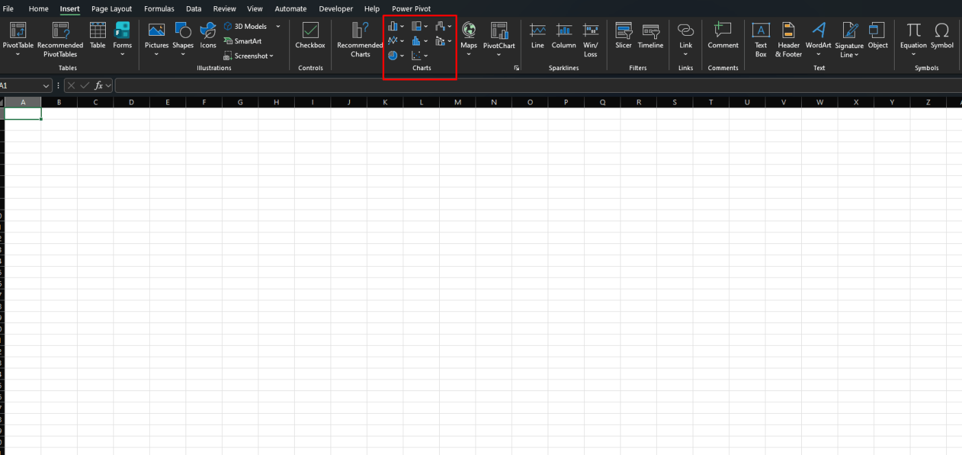
- choose Recommended Charts or pick a chart type directly
- insert the chart
- customize it if needed
Microsoft says the standard flow is to select your data first, then use Insert > Recommended Charts or choose a chart from the available chart groups.
Step 1: Select the Data First
Before inserting a chart, you need to highlight the data you want Excel to plot.
Microsoft says the first step is to select the data you want to use for the chart. It also notes that how the data is arranged matters for how well the chart works.
A simple setup usually means:
- labels in one column or row
- values in the next column or row
- no completely unrelated data mixed into the selection
Step 2: Use Recommended Charts
For most users, this is the easiest option.
Microsoft says you can go to Insert > Recommended Charts, then scroll through the charts Excel recommends for your selected data. It also says you can click a chart in the list to preview how your data will look before inserting it.
This is useful when:
- you are not sure which chart type to use
- you want the quickest chart option
- you want Excel to suggest a better fit automatically
Step 3: Choose a Chart Type Manually
If you already know what kind of chart you want, you can insert it directly.
Microsoft says Excel supports common chart types such as:
- column
- bar
- pie
- line
- scatter
Column chart
A column chart is useful for comparing values across categories, like sales by month or grades by subject.
Bar chart
A bar chart is often better when category names are long or when you want a horizontal layout.
Pie chart
A pie chart is useful for showing parts of a whole, but it works best with a smaller number of categories.
Line chart
A line chart is useful for trends over time, such as monthly revenue or attendance over several weeks.
Scatter chart
A scatter chart is useful when you want to compare two numeric variables and look for relationships or patterns.
These chart types are all listed by Microsoft among the common chart options Excel can create.
Step 4: Insert the Chart
Once you choose the chart, Excel inserts it into the worksheet.
Microsoft says when you quickly create a chart, Excel displays it as an embedded chart in the sheet. It also notes a fast keyboard method: selecting the data and pressing Alt + F1 creates a chart based on the default chart type.
That means you have two easy paths:
- use Insert and choose a chart visually
- use Alt + F1 for a fast default chart
Step 5: Customize the Chart
After creating the chart, you can improve how it looks.
Microsoft says you can start with a recommended chart or pre-built chart type, then continue adjusting it after it is inserted. Its chart support pages also show design and format tools for working with the finished chart.
Common improvements include:
- changing the chart title
- resizing the chart
- adjusting colors
- switching to a different chart type if needed
How to Pick the Right Chart
A chart works best when it matches the kind of data you have.
A practical rule is:
- use column or bar charts for comparisons
- use line charts for trends over time
- use pie charts for simple parts-of-a-whole views
- use scatter charts for numeric relationships
This is a practical summary based on Microsoft’s supported chart types and the way its chart pages describe using charts to fit your data.
Why Recommended Charts Are So Useful
Recommended Charts are useful because they reduce guesswork.
Microsoft says Excel recommends charts that suit the selected data, and it lets you preview how the chart will look before inserting it.
For beginners, that is often the simplest way to avoid picking the wrong chart type.
Common Mistakes to Avoid
Selecting messy or incomplete data
If the selected range is wrong, the chart can be confusing or incomplete. Microsoft’s chart instructions begin with selecting the data first because this step affects the result directly.
Using the wrong chart type
A pie chart is not always the best choice, and a line chart is not always right for non-time data. Microsoft’s chart tools include different types because different data needs different visuals.
Skipping chart previews
Microsoft’s Recommended Charts feature lets you preview the result before inserting it, which can help avoid poor chart choices.
Best Use Cases for Charts in Excel
Charts in Excel are especially useful for:
- sales data
- budgets
- school projects
- monthly reports
- comparisons by category
- trend tracking
- presentations
- dashboards
Anywhere numbers are easier to understand visually, a chart can help.
FAQ
How do I make a chart in Excel?
Microsoft says to select the data you want to use, then go to Insert and choose Recommended Charts or a chart type directly.
What chart types can Excel create?
Microsoft says Excel can create common chart types such as column, bar, pie, line, and scatter charts.
What is the fastest way to create a chart in Excel?
Microsoft says you can select the data and press Alt + F1 to create a chart based on the default chart type.
Should I use Recommended Charts in Excel?
Yes, especially if you are unsure which chart type fits your data. Microsoft says Recommended Charts lets you preview suggested chart options based on your selection.
Get genuine Office keys with instant delivery and smooth activation, so you can start building better spreadsheets and charts right away.